If you're new here, you should check out the A New Adventure post to have an idea of what's going on.
The first thing I want to implement in the engine is font rendering. It's kind of a big deal, not just for the game itself (user interface, settings, dialog, etc) but also to allow me to debug things - so that's what we're going to start with.
If you've never thought about it, here's a quick (and vague) primer on how fonts generally work. The simple way to render a font is to create an atlas, which is a single texture with all of the font glyphs rendered on it.
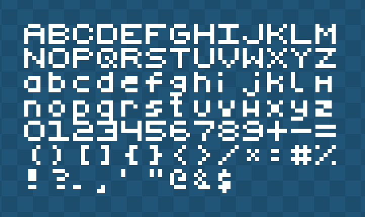
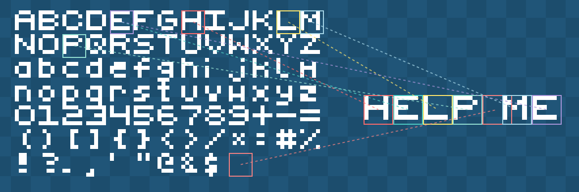
This is often called a "bitmap font". To render it, we create a map of where each character is on the texture, and then to render a string such as "Hello", we go through each character and draw that part of the texture.
This works really well for retro fonts, because you can scale them up and they still look good, it's part of the aesthetic. However, if we try to do that with a more modern font, we end up with stair-stepping (sometimes called "jaggies").

We could apply some anti-aliasing techniques often used when scaling things, such as bicubic or bilinear, but that looks even worse.

The actual solution here is to just render the bitmap bigger. The example used above uses 6x6 pixels per glyph, which is tiny. If we know we want the font to be at least 64px, then we render the glyphs that big. For bigger text, we'd need to push this to 128px or 256px depending on how crisp we want the font to be. You can see where this is going wrong.

A downside we have when using a bitmap font atlas is that it's not uncommon today to need more than the English alphabet. Most games support localization, so we'll need Latin/Roman characters for European languages, Hanzi (China), Kanji/Katakana (Japan), Hangul (Korean), Cryillic (Slavic), Arabic (Middle East/North Africa) and the list goes on.
If we're wanting to cover all localization (which is rare, but let's say we did), we're looking at 50,000+ glyphs! Assuming we optimized that into a 1-bit font, we'd be looking at a 220KB bitmap atlas. That's fine, right? We're still assuming this is for 6x6 pixels per glyph.
Going back to the previous thing I mentioned, if we wanted to render the font at 64px (and we'd need to do at least 8-bit to benefit from anti-aliasing) we're looking at a 204.8MB texture atlas. That's just not acceptable.

TL;DR: The bitmap texture atlas approach is great approach for retro games with a 1-bit font approach, even with full localization, but for modern font use, it doesn't scale.
The most common solution to the aforementioned problems is to do it on the fly. Instead of having all the glyphs rendered out in a texture, you render them when you need them.
You start by creating an empty texture on the GPU at some arbitary power-of-two dimension, and then draw the characters onto that as you need them. When the texture becomes full, simply increase the dimension (often doubled on alternating axis).
The first question is, where do we get those characters from? The most common answer would be a font file, such as TTF (TrueType Font). A TTF file stores the outline of a font in straight lines and quadratic Bézier curves, which allows it to render the font at any scale.
There are other font types, such as OTF/CFF which use cubic Béziers, but it all boils down to the same principles, so we'll just talk about TTF.
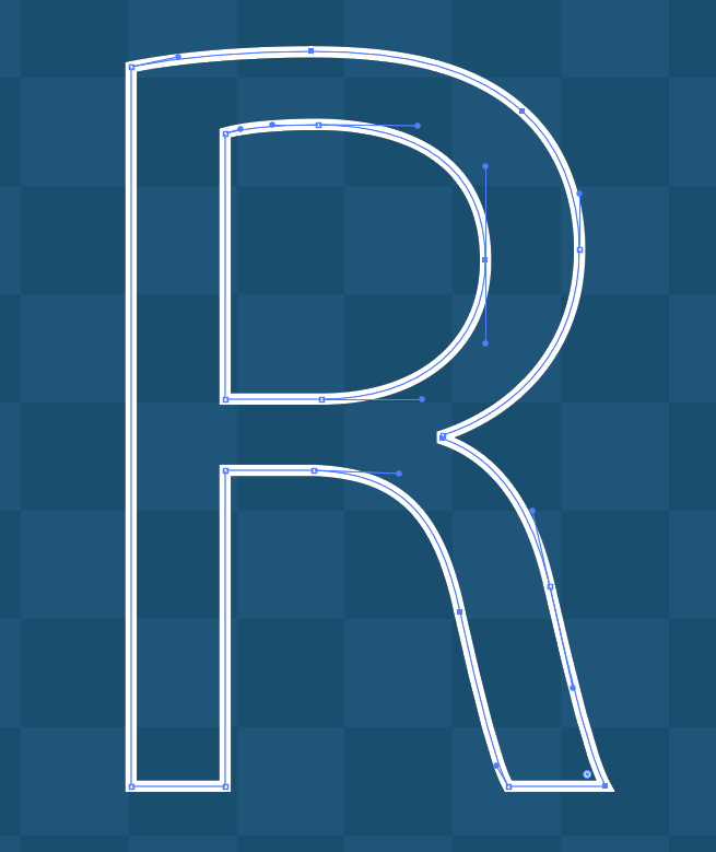
Hold the phone. If we've already got the glyphs as curves (essentially a vector), that we can render perfectly at any scale - why are we not just doing *that* instead of rasterizing them?
The short answer is that rendering vector curves in real-time is expensive. We'd be evaluating the curve equation, sorting the pixels (inside/out), and anti-aliasing it on every frame. Texture sampling is cheap, it's what a GPU was built to do. So, we render the vectors once (rasterization) at a specific resolution, and use that - winning!
We are... winning, right?

We've "solved" the stair-stepping issue (the "jaggies"), but remember how I said at 64px the texture atlas would be astronomically large? We're still building that atlas, just on the GPU.
Regardless, this is what most games do. They just accept that there's no scenario where all 50,000 glyphs will be required, and only render the fonts at fixed-sizes. You can specifically render it at 16px, 32px and 64px, and then choose the closest to that. Or, render it at 64px and downscale it for the other. What's the problem then?
It's simple: I don't like rasterizing fonts. If you decide your baseline font size is 64px, but then you want to add an effect where the font pops (such as floating combat text), you're going to see the effects of the rasterization (the "jaggies").
You can solve this by rendering the font at a bigger size, or even just letting go of the wheel and dynamically rendering at whatever size is requested... but it doesn't feel like a good idea.
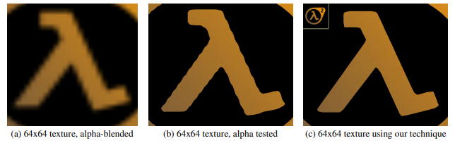
In 2007, Valve posted a paper for SIGGRAPH titled Improved Alpha-Tested Magnification for Vector Textures and Special Effects, which details their approach of computing the shape of a vector by using distance fields.
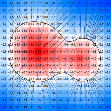
Today, this is commonly known as a Signed Distance Field (or function). Essentially, you create a texture (let's say 32px in dimension), and at each point (pixel) you encode the distance to the nearest edge of the shape.
If the point lies within the shape, the distance would be positive, if the point lies outside of the shape, it's negative (hence the "signed" part).
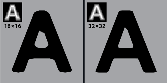
Seems great! Why is everyone not using this? Well, some people are! Valve have been using it to render fonts/icons in their games for two decades now, but it's not perfect. Even at 32px, sharp edges don't always look great.
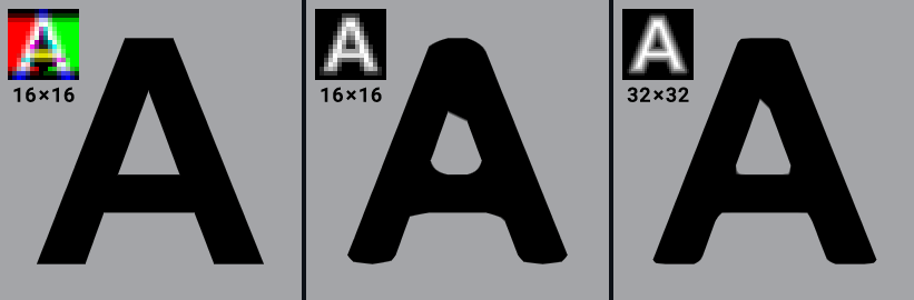
Valve's approach in this paper is using a "monochrome" approach; it uses a black and white image, encoding the distance values as the intensity of each pixel. Textures aren't limited to just one channel though, they commonly have three, which gives us two more channels to pack data in.
This is where Viktor Chlumský's paper Shape Decomposition for Multi-channel Distance Fields comes in. In Viktor's technique, he utilizes all three colour channels, which produces (almost) perfect shapes, even with sharp edges.
Using multi-channel signed distance fields, or MSDF for short, we can take a font we have in a TTF file and compute the fields. Doing this on Google Sans Code, we get a lovely texture like this.
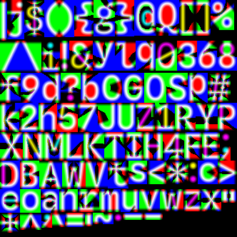
For the purposes of testing/demonstration, I'm only using a basic English character set here.
Now that we've got our lovely psychedelic texture, we need to actually do something with it. So, here's the plan:
And to make a GPU do that, we need to write a shader, which looks something like this.
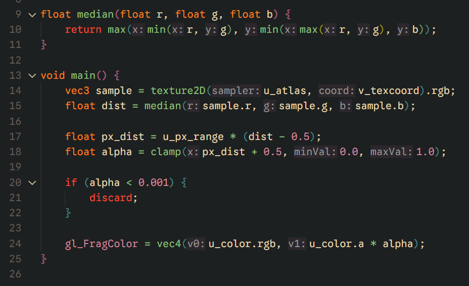
Put it together and what have you got? Crisp, real-time font rendering at any scale, from a single static texture.
Phew. That's the first step on the massive mountain ahead of us. There are some limitations with MSDF font rendering; for very thin or extremely complex glyphs, it will struggle, but for my game engine, it's a perfect fit, and I don't have to lose any sleep over the "jaggies" anymore.
Get notified when new posts are published.
Comments
No comments yet. Be the first to comment!